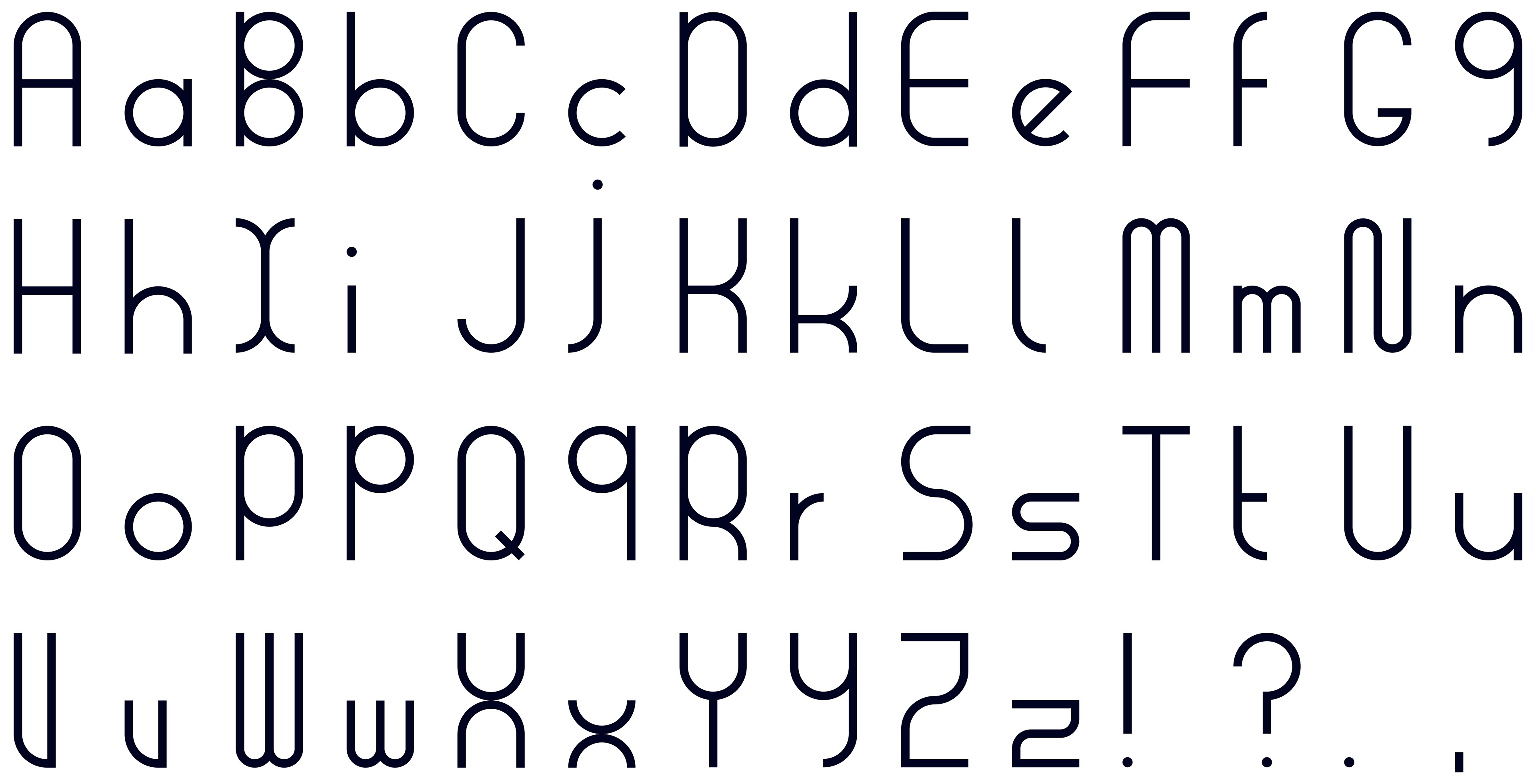
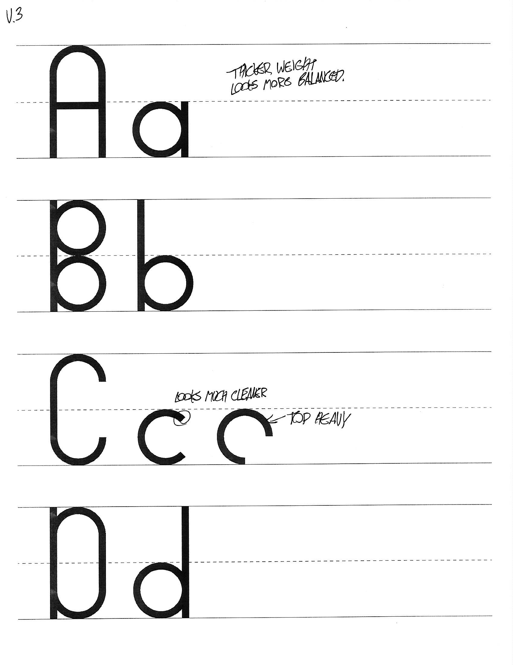
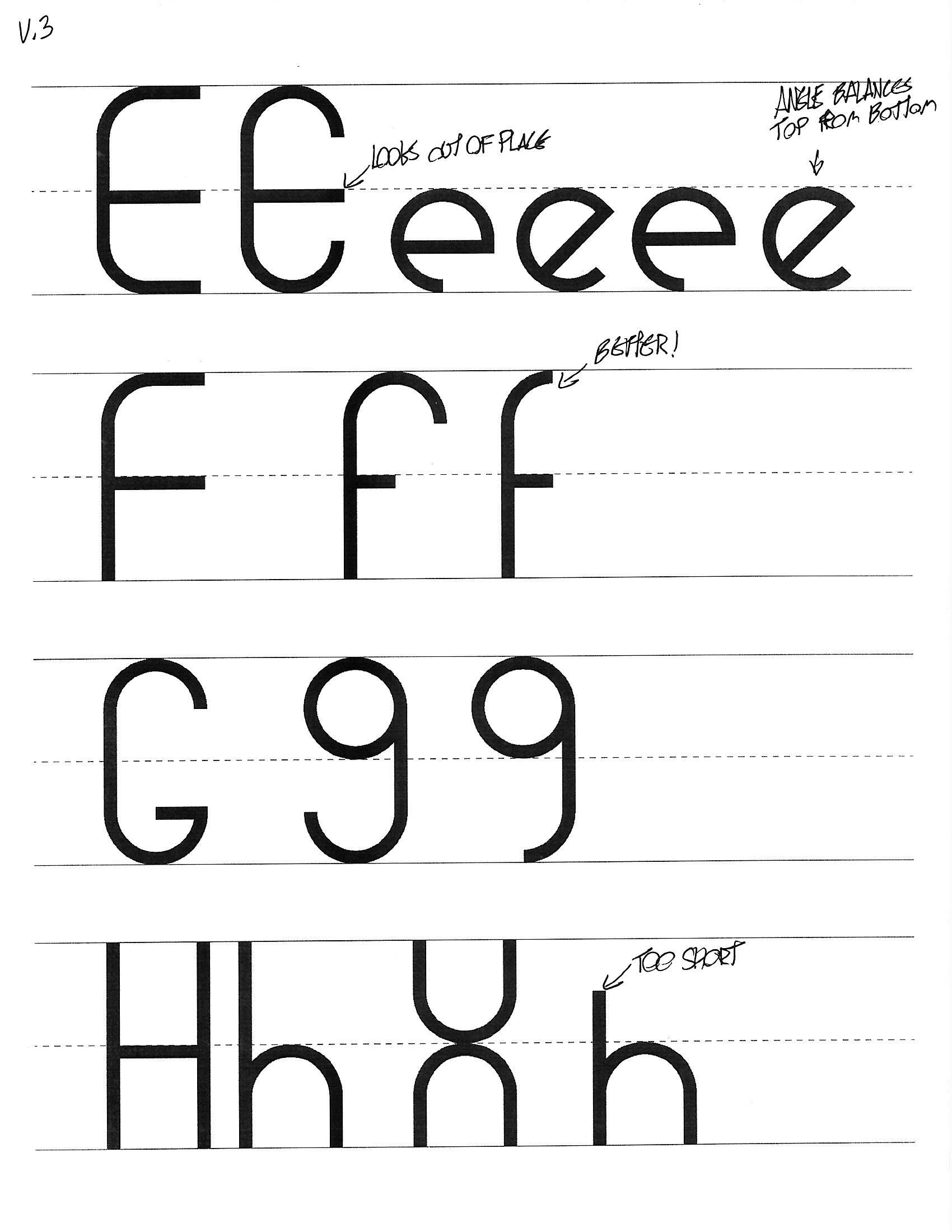
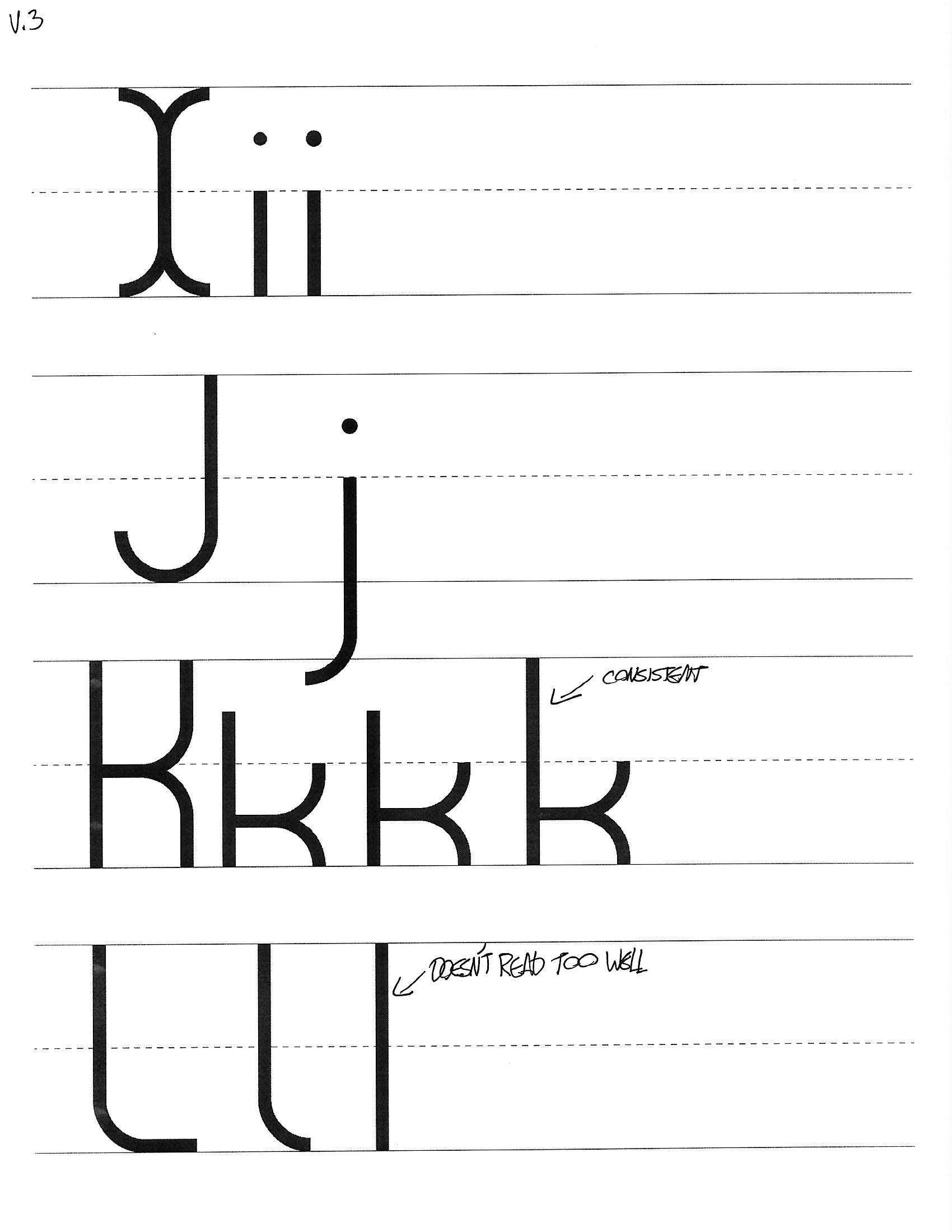
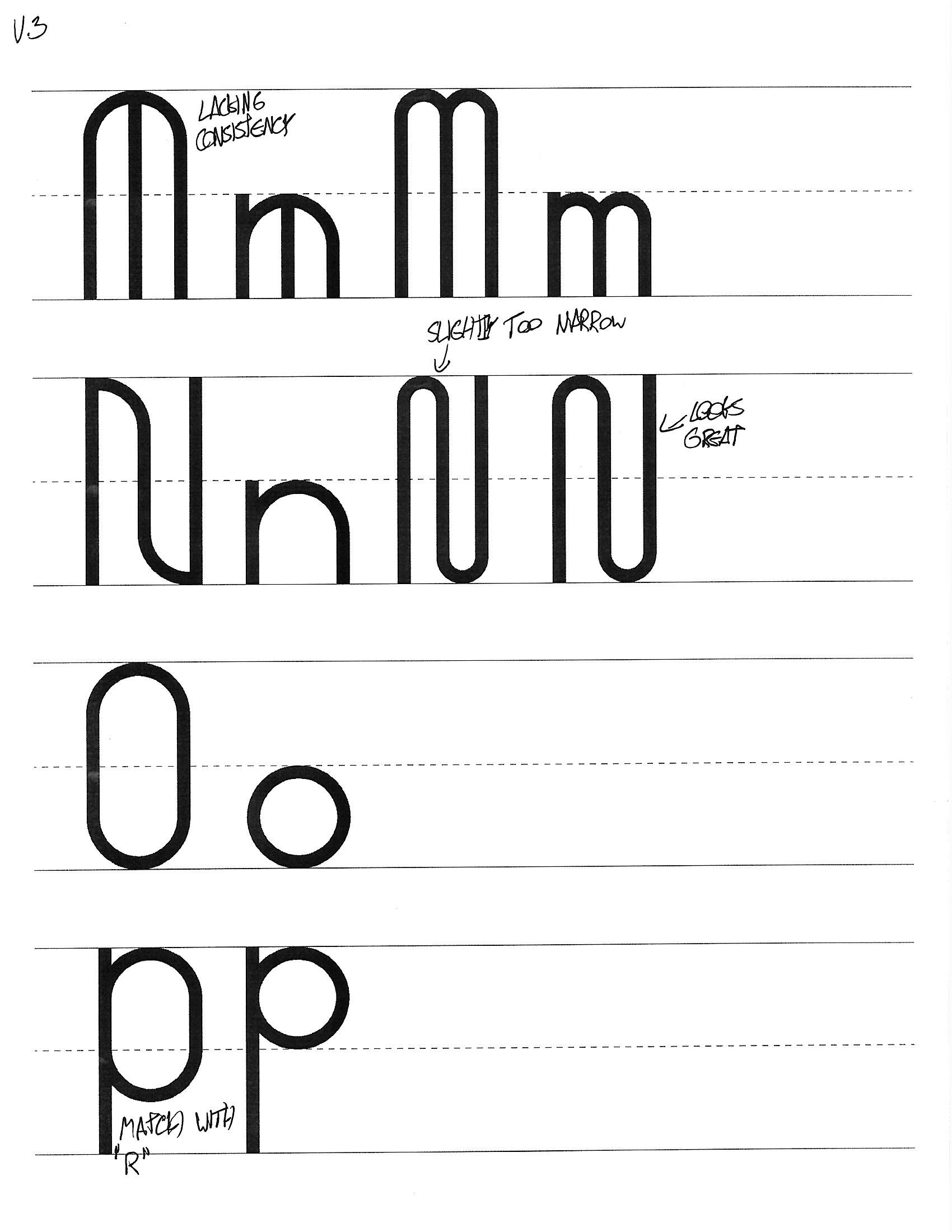
Figureeight is a typeface that is created within the constraint of being as simple as possible. Optical compensation and ornamentation were foregone in pursuit of simplicity.
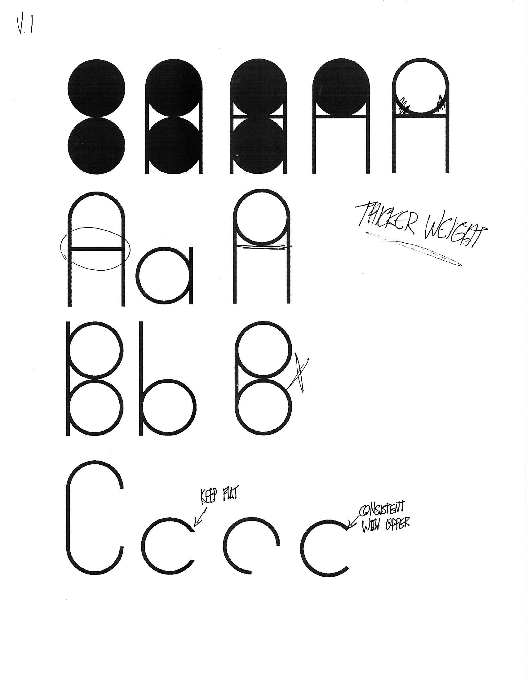
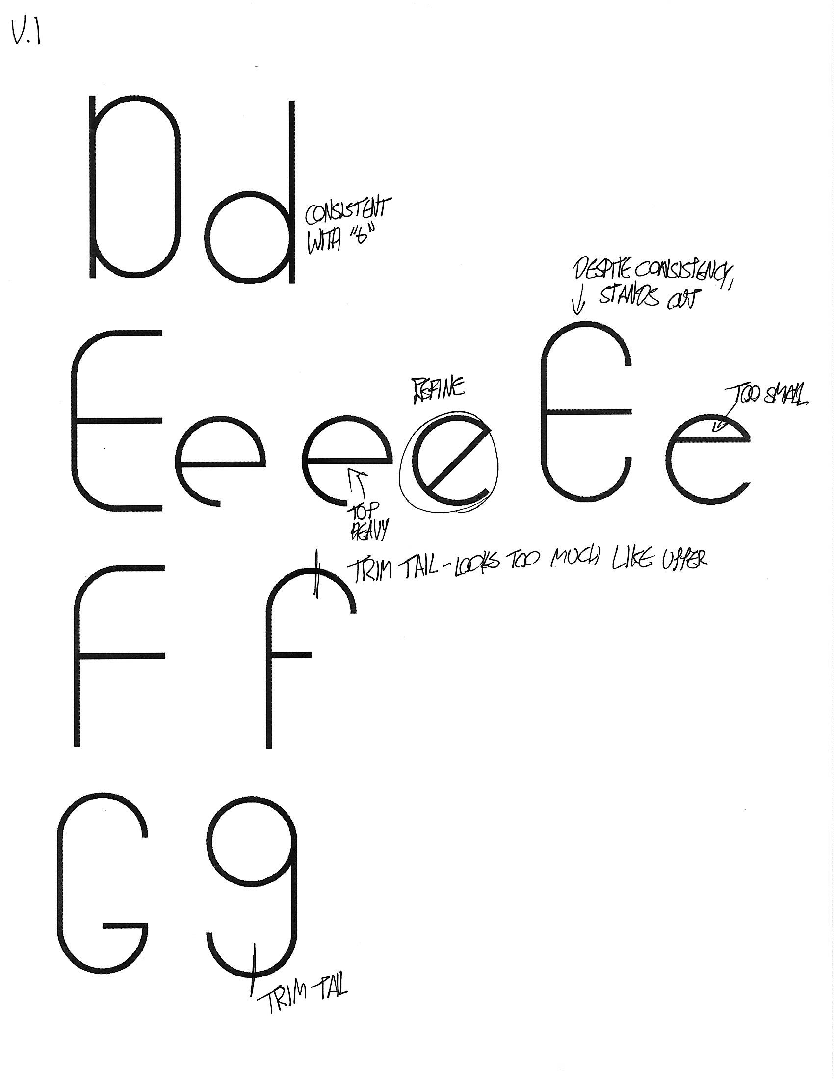
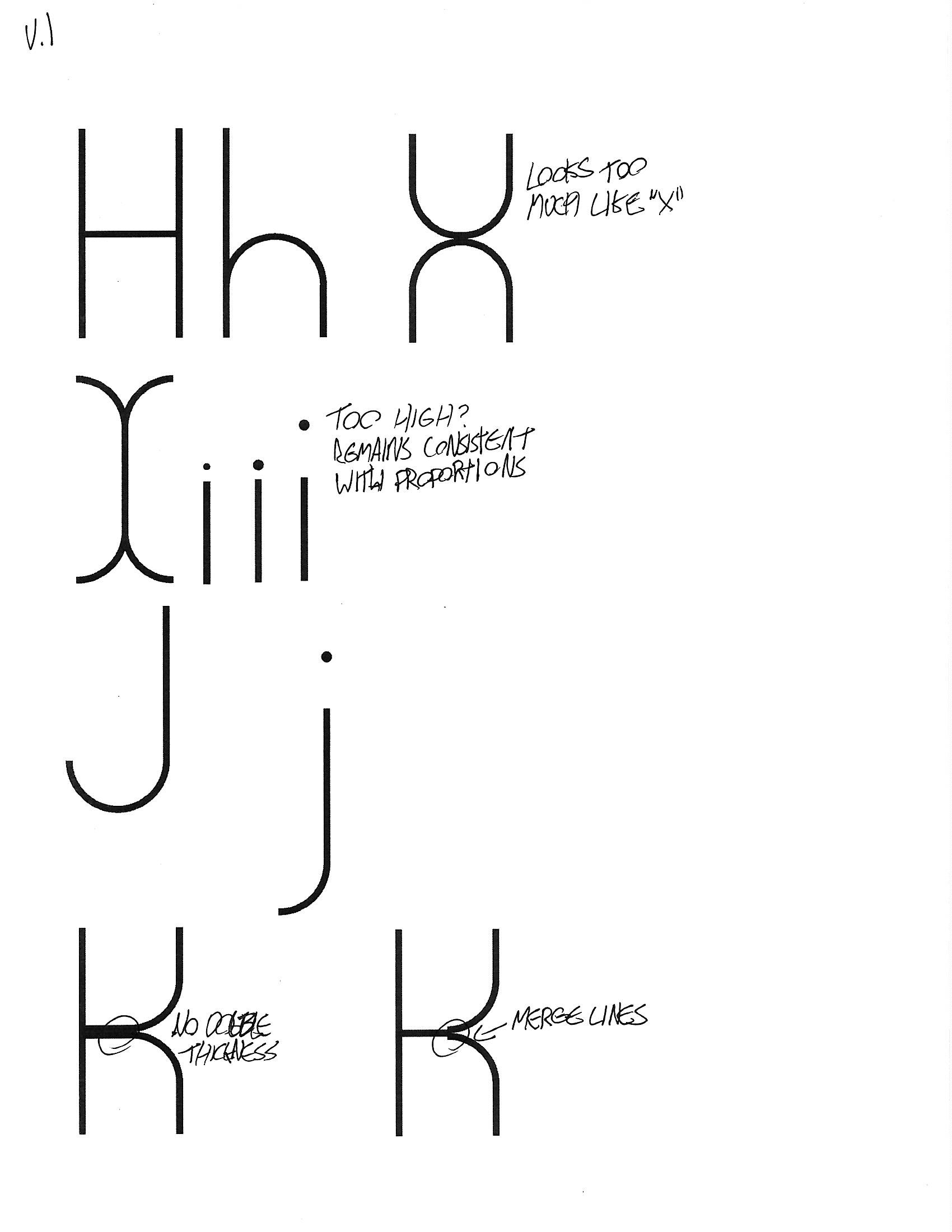
Each character was constructed around two identical circles and their proportions. This constraint created a harmonious and graphically clean typeface.

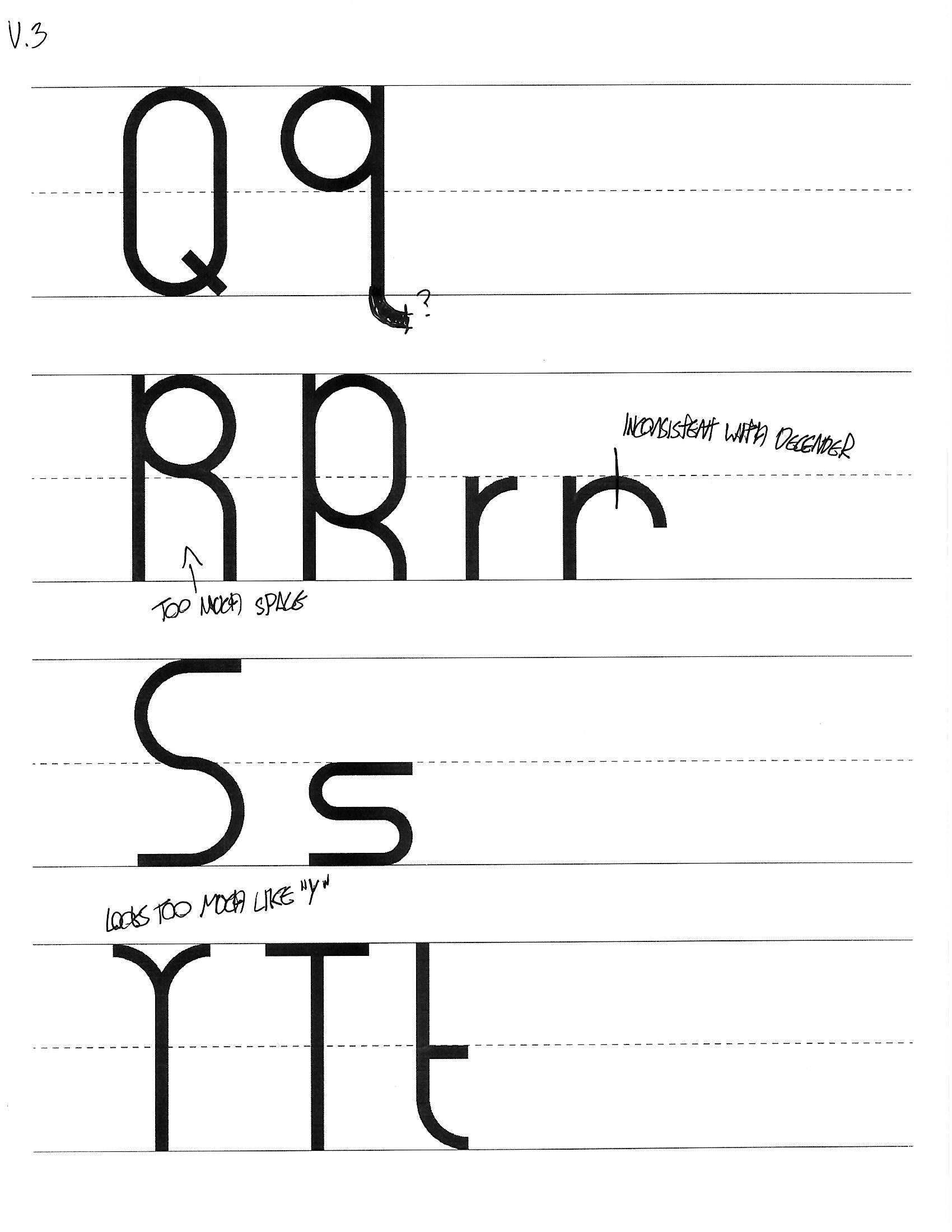
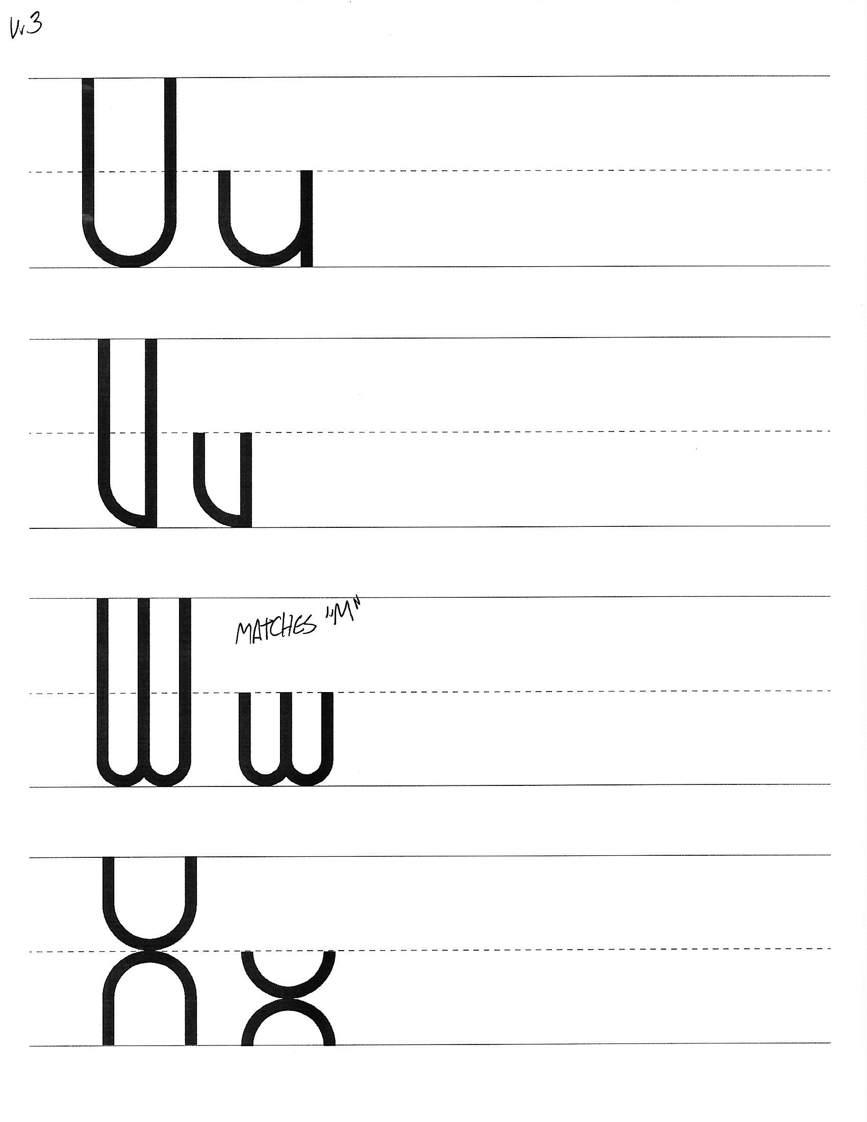
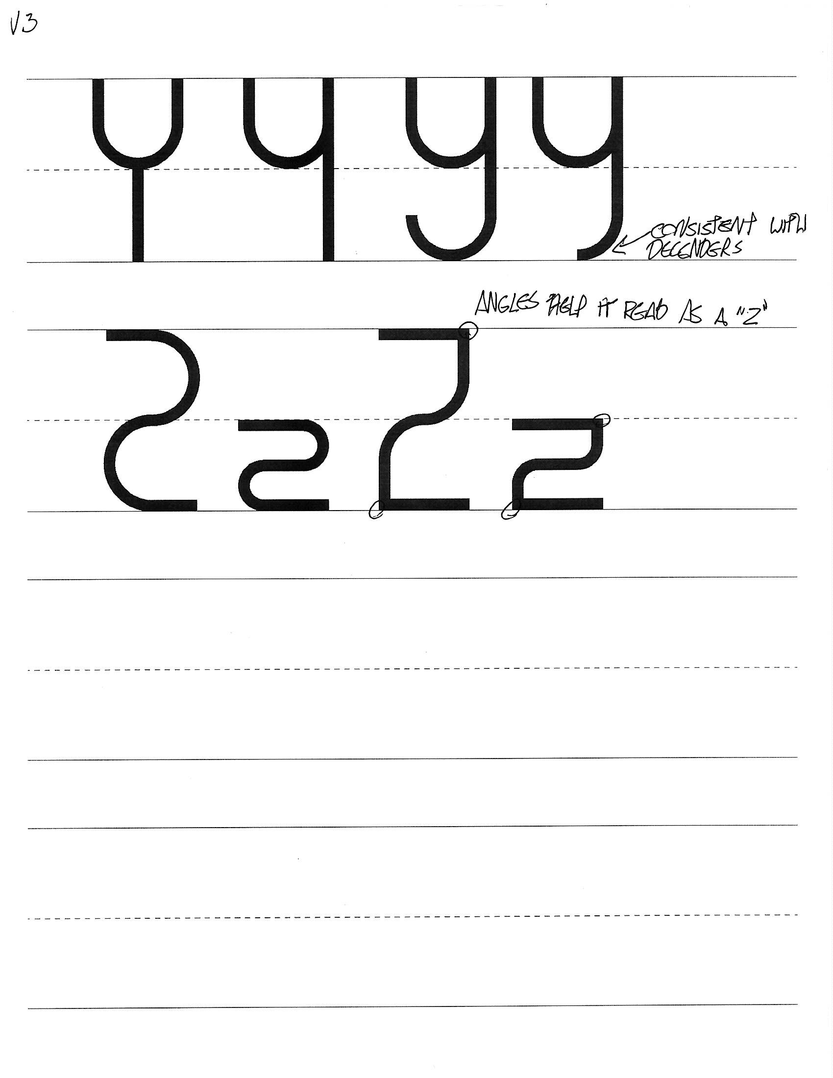
As the font progressed, standards were put in place to keep elements looking coherent. Many elements were reused due to the modular nature of the design. Inspiration was drawn from Bauhaus typography.

The goal of this project was not only to produce a clean looking typeface, but to create a final product that was sound in its conception. It serves as a demonstration of what can be considered legible, all while remaining as simple as possible.